

My Space
8 interior designers on their favorite rooms, along with the “how-tos” behind their masterpieces.
-
CategoryHomes
 Where Luxury Meets Real Life
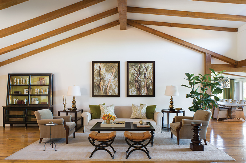
Designer Mark Langos created this spacious, elegant living room for a family with three young children moving here from the East Coast. “The living room needed to be dressed but not overdressed—a place where my clients could entertain on a large scale, relax more intimately with friends and play board games with their children,” he shares.
With grand proportions, voluminous rooms with tall ceilings and strong architecture, the hilltop home has views from almost every room. Mark chose a rich color palette of olive, caramel and taupe—organic neutrals aimed at creating a seamless flow between the indoors and out.
The living room, which is accessible off the front door, provides passage to the rest of the house. With only one wall to constrain, Mark set out to create a more intimate space, avoiding the vibe of an “overgrown foyer.”
He achieved that by thoughtful arrangement and placement of appropriately scaled furniture pieces. The large, custom-designed coffee table anchors the living room; interesting seating provides the boundaries. For added interest, the interior of the antique bookcase on the left was hand-painted in horizontal stripes, mimicking the fabric upholstery.
The result: distinct elements that work well together, giving sophistication and comfort to the space, as well as creating anticipation for the rest of the home.
 Rustic Haven
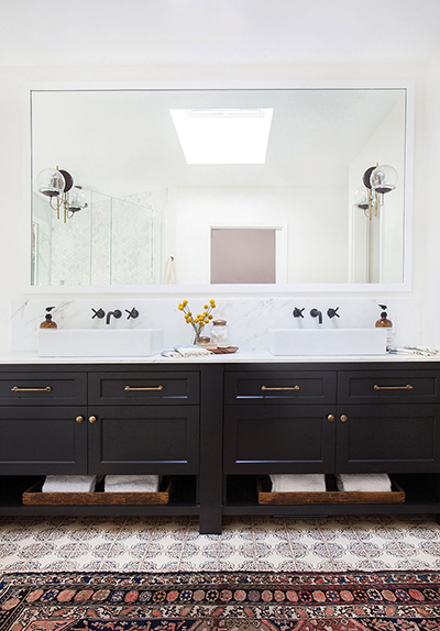
Woodland Hills-based designer Amber Lewis designed this master bathroom for two busy doctors. “We wanted the space to feel bright and inviting but have an understated luxury to it,” says Amber.
The unassuming home is tucked into a lush, dense, tree-lined street and has the vibe of a cabin retreat. Keeping with the rustic theme, Amber chose hand-painted terra-cotta floor tiles from Tabarka Studio. The tiles make the space feel eclectic but, at the same, time fresh and modern. Calcutta gold marble and modern lighting (from Schoolhouse Electric & Supply Co.) finish the look.
With modest square footage, careful thought was given to the floor plan to allow for a separate tub and shower, water closet and vanity. A smaller makeup vanity was also built (not pictured) by reconfiguring the master closet adjacent to the bathroom.
Amber credits the natural lighting in the bathroom for making it all work. Two large picture windows—one over the tub and one in the shower—as well as a skylight were added, also allowing for a view.
“The bathroom backs to a private patio with amazing greenery, so the windows allowed for us to bring the outdoors in,” Amber says. White walls and a bright, neutral palette provide further enhancement, while making the bathroom appear even larger.
The space is a study in contrasts. The rustic tiles and vintage rug add what Amber describes as “a found, collected feel,” while the neutral surfaces and modern fixtures make the space feel relevant and fresh.
Photographed by Tessa Neustadt
 Casual Chic
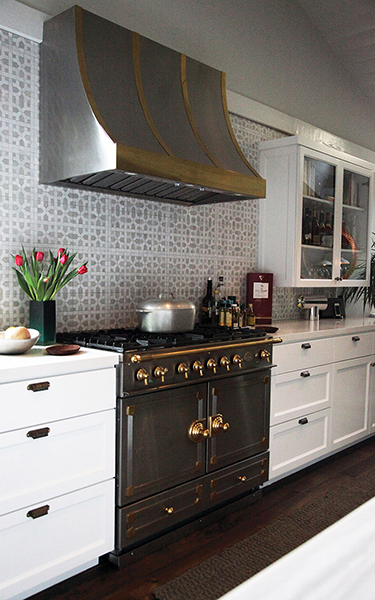
An integral part of this kitchen’s success lies in the decision to open up the 8-foot ceiling and add a vaulted ceiling. “It really creates the feel of this entire space,” designer Dana Rae says.
The handsome La Cornue stove and custom hood with copper and brass accents are indisputably the focal point of the kitchen. To avoid competition, Dana chose a subtle color palette in white and grey. Color was incorporated with accessories including pottery.
Striving for as much natural light as possible, minimal upper cabinetry was built, allowing for more windows. A dormer was added to bring in more light as well as provide mountain views. All the fixtures were purchased at Ferguson in Woodland Hills.
Tile was obtained from Mosaic House in New York. “When we saw the handmade, white-and-grey Moroccan tile, we knew we’d found something very special. It looks old, which gives the space a really interesting look and feel, so we decided to tile the entire wall,” Dana explains.
 Sunny Space
This large kitchen in a contemporary home is light-filled and bright while maintaining a warm feeling for guests and family who always seem to gather in the kitchen. Given that the majority of the surfaces in this kitchen are white, designer Sandy Weinstock had to do some strategizing on how to avoid a cold or uninviting vibe—and to create one that is warm and welcoming.
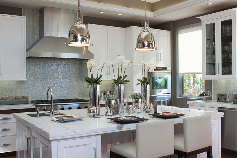
She achieved that by anchoring the kitchen with a dark, hardwood floor and by carefully choosing light-catching materials like the iridescent, mother-of-pearl backsplash tile. The cabinetry has a high-gloss white lacquer finish; countertops are Carrera marble.
A multitude of four-inch, recessed, dimmable, LED ceiling lights were used to provide strong task lighting for the kitchen. Large, polished nickel pendants from Restoration Hardware are positioned over the center island.
“This kitchen represents the glamorous, high-end look that complements the rest of the client’s home while being highly functional—whether preparing a simple family dinner or entertaining for a crowd,” Sandy shares.
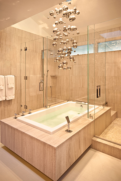
 When in Bath
For this Encino master bathroom in a “classic contemporary ranch,” designer Dayna Katlin came up with the idea of having the tub dissect the shower but still allowing walk-through space to the other side. “I wanted a little elegance and a place that would be visually exciting to use on a daily basis, almost like a living room bath,” Dayna says.
During construction, the ceiling was raised and skylights were added, creating a space for a chandelier. “The height of that chandelier magnifies that entire space, giving it a larger, ‘the sky’s the limit’ feel. I felt that it added an ethereal quality to the space. It reminded me of bubbles over the tub,” she says.
Dayna used a mixture of functional yet distinct textures and surfaces: grass cloth on the walls, ebony and nickel mirrors and marble tiles. Matching the vibe of the rest of the home, the master bathroom is elegant yet designed for to match the couple’s needs and tastes—and there’s more.
“The husband actually has his own bathroom too. He enters it through his closet. It has a really masculine feel to it. The combination of both bathrooms in this home make it really livable and comfortable for them.”
 Farmhouse with a View
The family room of this Colfax Meadows home is a perfect example of the design sensibility of the entire expansive property, which has the urban vibe of a New York City loft mixed with the charm of an East Coast farmhouse.
The space, by interior designer Christina Malpero-Wheeler, has a polished cement floor topped by a patterned “shag” rug. Sofas are slipcovered in white and strewn with colorful, patterned pillows custom-made from fabrics bought at various flea markets.
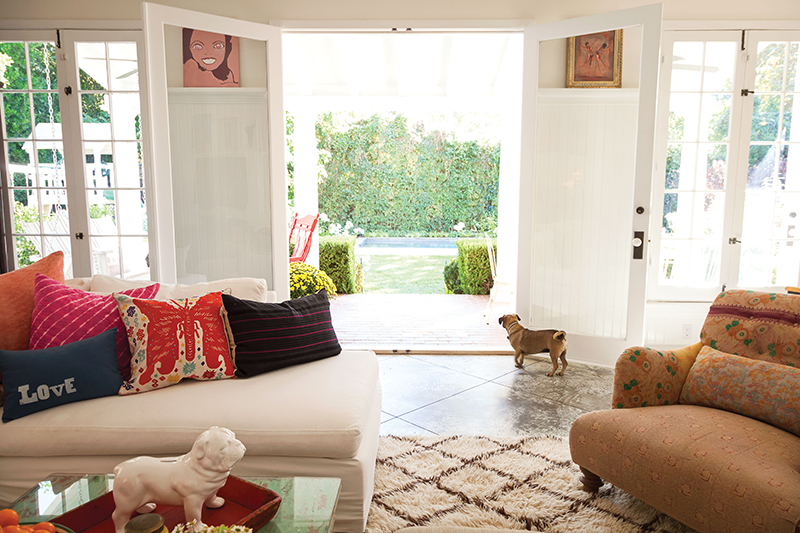
“I just love pops of color in a room. The really fun thing about having pillows like this is when you get a little bored, you can switch them out,” Christina says.
Glass-paned double doors open to the back porch, flood the room with light and offer a peek at the sprawling lawn that lies below. The red accent is echoed with chairs on the front porch.
“My design philosophy is all about the way a room feels,” Christina shares. “It has nothing to do with rules. It’s all about a feeling; it’s all about creating a home and a place for people to really live in.”
Contemporary Antiquity 
The owners of this living room turned to designer Sarah Buxton for an elegant place to entertain guests—but one that also felt comfortable enough that they could kick back to read a book by the fire. While their instructions were simple, designing the long and narrow space was a bit of a challenge.
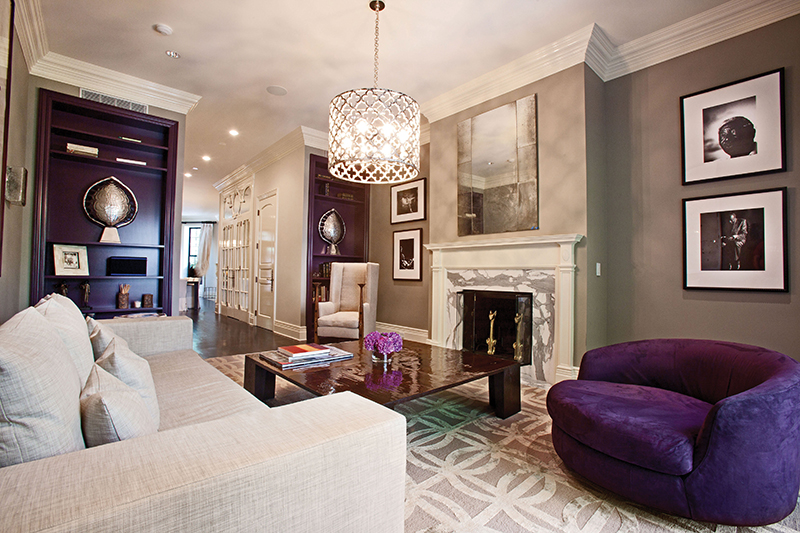
“I couldn’t make a space behind the sofa, so I just used the back wall as part of the arrangement,” Sarah says. “Also using the purple chair on the side brought the space in a bit, ultimately creating more of a square than a rectangle.”
That square illusion was further enhanced with the use of dark aubergine paint on the bookshelves. A fireplace was added to the space, as well as a few carefully appointed antique pieces bought on both coasts.
The purple swivel chair was “stumbled upon” in a SoHo antique store; the chandelier is from Kneedler | Fauchère. A 19th-century English arts and crafts wingback reading chair was selected for its old-world character “and because you can place a drink on the flat top of the arm.”
Sarah describes the resulting design as a “modern take on an old-school Manhattan brownstone—modern but with a sense of comfort.”
Photographed by James Moss
 Casita Near the Canyon
While some guesthouses are destined to be showpieces, this one in Sherman Oaks was designed for active living—from a family’s need to accommodate sleepovers and entertain groups to just the desire to spread out. Aiming for a serene “casita by the sea” vibe, architectural designer Allison Knizek chose cool shades of grey, white and blue with fuchsia accents for a punch of color.
A cabinetmaker built custom cabinets and a pedestal breakfast bar table in the kitchen. Finishes throughout the guesthouse range from a bright white, water-based lacquer to driftwood grey to dark ebony.
For furnishings, Allison took a practical approach, turning to mass retailers such as West Elm and Crate & Barrel. Fabrics were also selected with practicality in mind.
Even though there is a fair bit of white, everything in the house is wipe-able or washable cotton, including the mixed-stitched bedding. Sunbrella was used on the breakfast bar cushions and chairs.
Caesarstone surfaces are in London grey. “It gives the veined beauty of a white Carrera or Calcutta marble but without all the fuss,” Allison shares, adding that it needs no sealing and most spills can be easily wiped clean.
The grey, sanded concrete floor (simply the foundation of the house) was left intact. Allison had it polished and sealed with a clear finish.
“You can see lots of sand and gravel in the texture, not to mention the odd leaf or rock that fell in when the foundation was being poured. Now that these elements have been ground down, it has a very earthy, organic look,” she explains.
Architect May Sung Comes to The Rescue on a Studio City Reno Gone Wild
In the right hands…finally!