


Color My World
With a well-defined strategy, bold strokes of color can yield wondrous results.
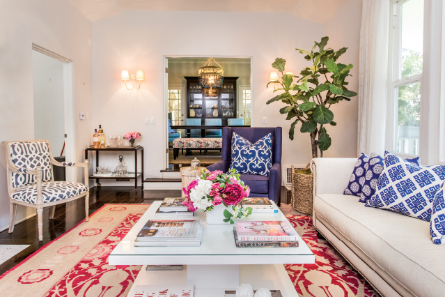
Sure neutrals can soothe, but after awhile they can leave you hankering for a burst of color. From fuchsia to eggplant, rich colors can up the ante on a space.
Take a look at what Sherman Oaks-based designer Lisa Lerner did with this Studio City “transitional” home belonging to Sarah Thomas. Sarah, who owns and is the director of Sunnyside Preschool in Studio City, has always been a fan of bold shades. So from the get-go color was on the menu.
Lisa started with navy and a natural linen shade. “I typically introduce only two main colors into my design palette. Introducing too many colors can make a room feel chaotic. From the dominant colors chosen, I then incorporate different shades into the space.” Lastly, Lisa selects an accent color. In this case it was pink.
The designer says it’s also important to determine what the client’s goal is as it relates to adding color. “Are they looking to feel happy, calm, inspired? Do they want their space to be dramatic, glamorous or casual chic? Choice of color is the driving force for how you feel when you walk into a space.”
Sarah’s goal was simple: “I wanted the house to feel happy and bright.” And as you can see, indeed it does.
- The rug is from The Rug Warehouse in Culver City. A Soumak Arts & Crafts style rug, it is the “tour de force” in this room. It is bold and fun.
- The vintage chairs that flank the fireplace are upholstered in Kelly Wearstler’s Modern Trellis for Schumacher. They provide dimension while adding something unexpected to the space.
- I chose books in our color scheme—blues and pinks—and then layered them in stacks of two or three. I placed (on the lower level) accessories on top of the stacks.
- When I presented Sarah with these John Robshaw pillows, she loved them, so I ran with that navy color palette with shades of neutrals to compliment.
- A white hue, “Foggy Day” by Dunn Edwards, was used on the walls. Believe it or not, there is a hint of green in it!
Think Pink
Knowing of Sarah’s love of pink, when it came to the family room, Lisa chose dark pink and yellow as the two focal colors. The first thing purchased was the bold multicolored rug (also from Rug Warehouse) and then the raspberry-colored sofa. “I had the sofa custom-made as well as the ottoman , which picks up the yellow in the rug. Woven wood shades allow maximum light to illuminate the space. The yellow throw is from Williams-Sonoma Home.