


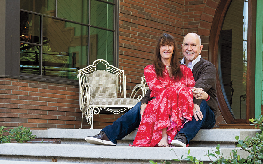
When Rebecca Budig, an actor best known for her work on General Hospital, and her husband, a marketing executive, decided it was time to move from their 1,300-square-foot home in Lake Hollywood, they started looking at mid-century modern homes in the Valley. In 2019, they purchased one perched high in the hills of Encino. Built in 1962, it had been remodeled in the ’80s and was, as Rebecca puts it, “a big box” in need of an update.
Above: Rebecca and her daughter, Charlotte
•••
“I really wanted to create an open space where our daughter could run around and our extended families could stay with some room to breathe,” Rebecca says. “It had to be one-story, and light was very important to me. I wanted it to be modern but warm.”
While on the house hunt, Rebecca had seen several houses by architect Arin Zarookian. She reached out, and the two met at the property.
“The view was amazing, and it was surrounded by tons of charming trees,” Arin recalls. “The orientation of the existing building was thoughtfully placed, which helped save some of the foundations, but I immediately knew this wasn’t the light remodel they’d hoped for.”
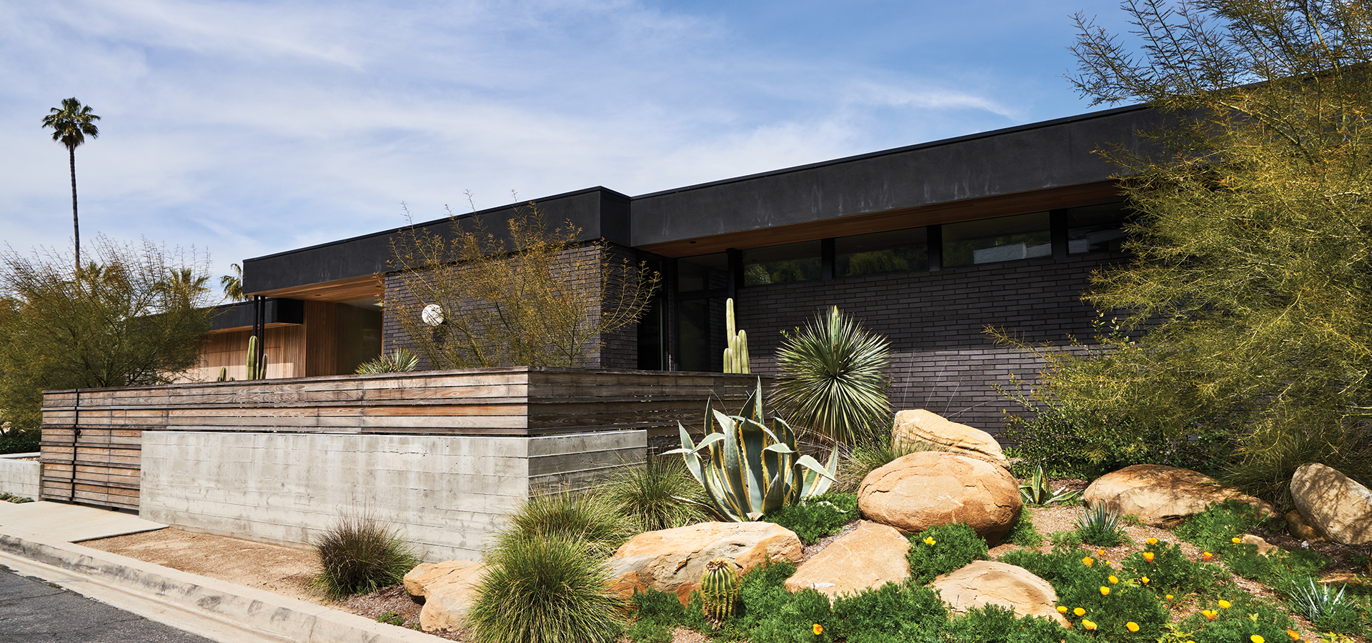
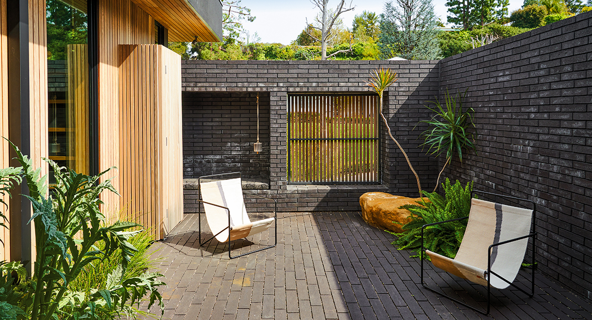
Above: The long, flat rooflines are paired with clerestory windows, allowing for ample light and a mid-century vibe. Arin did the landscape design himself, sourcing materials at Ramy’s Nursery in Reseda.
•••
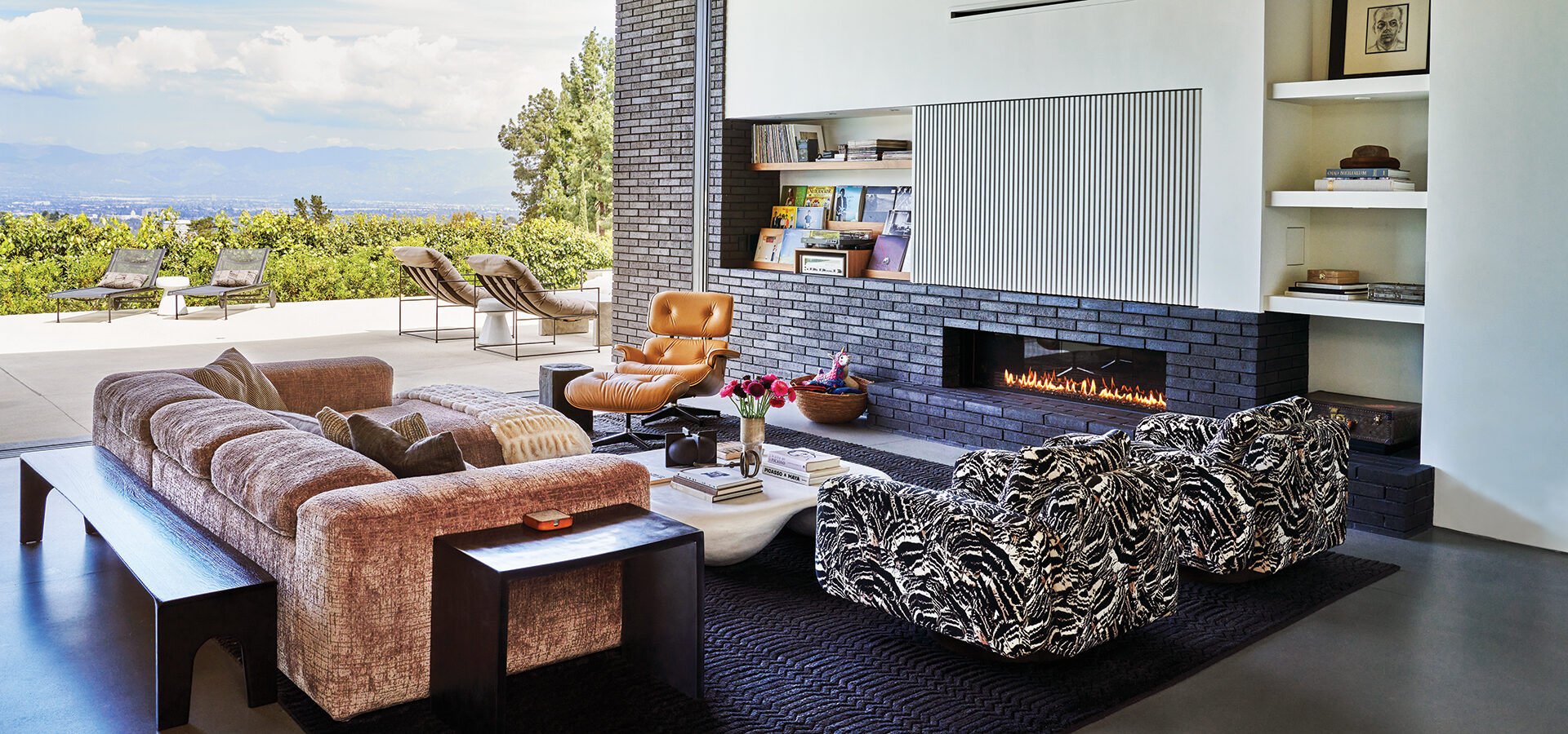
The structure was taken down to the studs, and plans began for a new 4,000-square-foot home. Heeding Rebecca’s desire for light, Arin raised the ceiling throughout the main living area from 8 to 12 feet. He also included floor-to-ceiling, multi-sliding pocket doors by Western Window Systems across the back of the home, allowing for a full 180-degree view, as well as clerestory windows—a hallmark of mid-century moderns—across the facade.
Arin admits that he has an affinity for that architectural style. “My father was an architect who studied at USC in the ’50s under many of the MCM masters, and worked for Buff, Straub & Hensman in his youth. Growing up in LA, we would drive around stalking Case Study Homes and many of Lautner’s and Neutra’s works.”
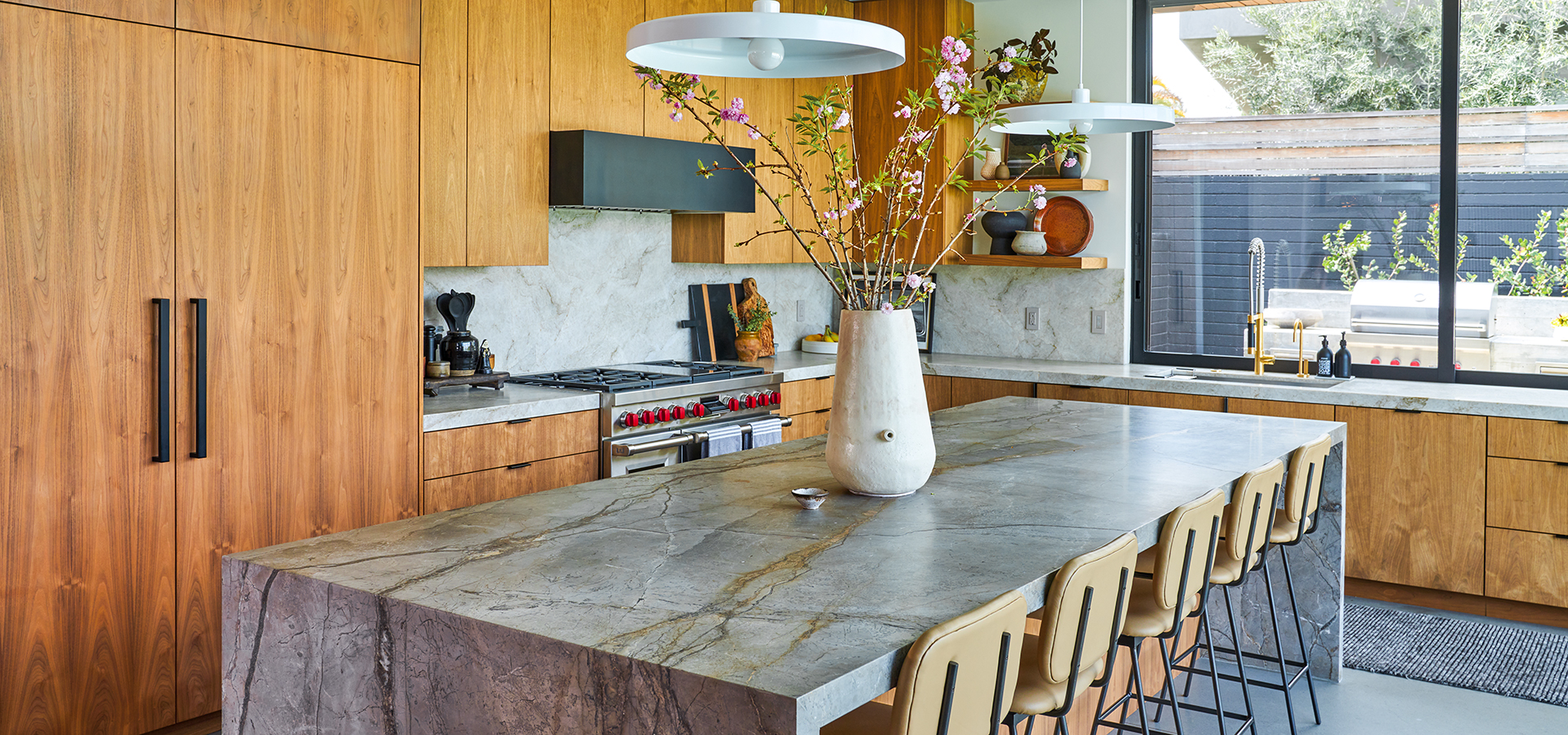
Above: Rebecca made stone an integral part of the interiors; all of it is from Tristone & Tile. The kitchen features a “waterfall” center island with Essential Grey marble. It also has low upper cabinets, which were popular in the ’50s and ’60s. The cabinetry (and all the woodwork in the home) is by Laforma.
•••
Yet with Rebecca’s home, he says an MCM structure was not the sole intention. Instead, the overall goal was to create a family home that incorporated Rebecca’s wish list—for light, warmth and texture—and to avoid the aesthetic of a brand-new shiny home.
“As far as not looking slick, a lot of that has to do with materiality. Other than the roof fascia, there’s no stucco on this house. The use of natural, honest, and imperfect materials like the warm woods (both siding and walnut casework), the grainy and integrally pigmented brick, the terrazzo-like honed concrete with its specks of aggregate, the natural stone slabs. All of these materials ground the house and give it a bit of an aged vibe,” he says.
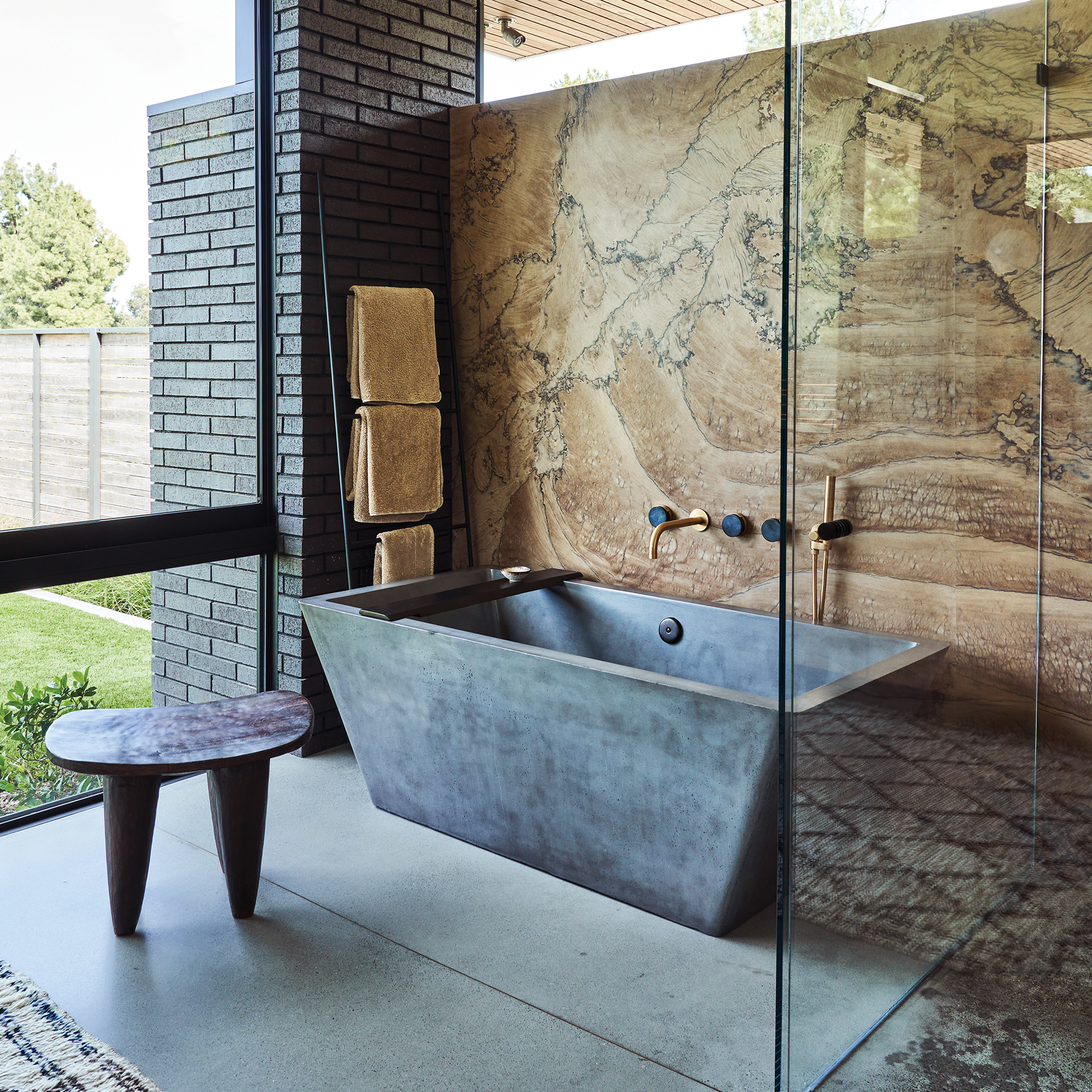
Showstopping Macaubus quartzite on a wall in the primary bathroom
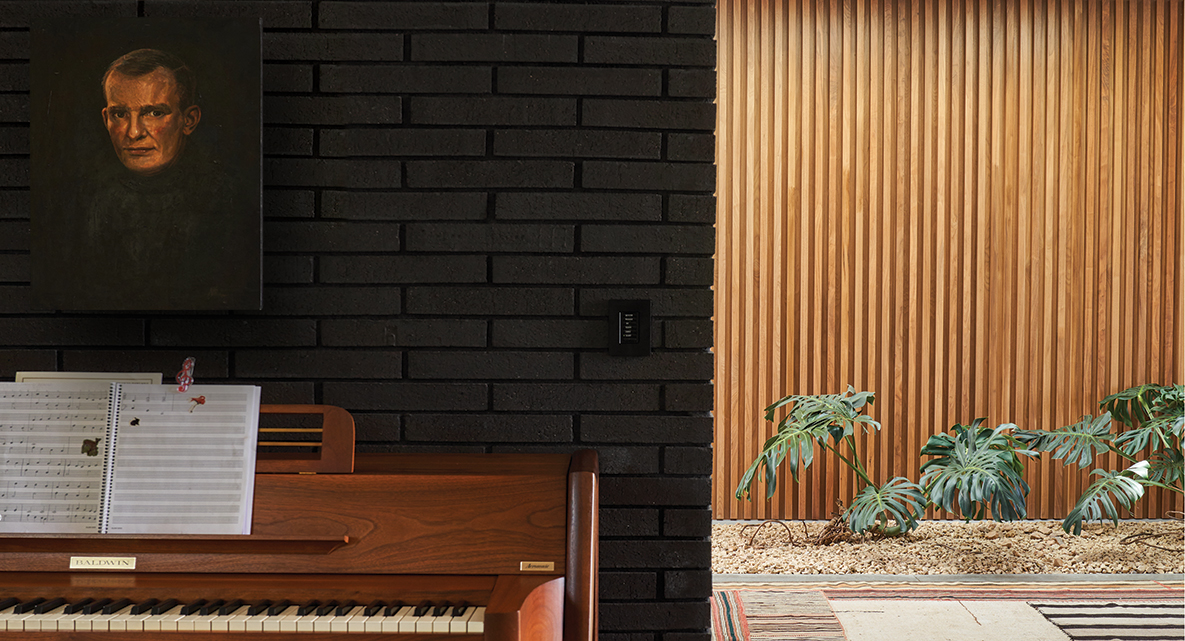
One of the keys to a successful design, Arin believes, is observing the way a client lives. During the planning months, he spent time with Rebecca at the Lake Hollywood house “getting a snapshot of their life. I’d be at the dining table with my laptop showing her preliminary designs and inspo pictures, and she’d be peeking at my screen yelling ‘Love it!’ She’d walk me through the house, showing me the organizational style in her closet and kitchen cabinets and special items that she wanted to include in the design. For example, her grandfather’s beautiful photographs of her and her sisters as children, and a vintage mid-century piano.”
Despite the collaborative harmony, there were a few debates, like the one over the wood ceiling. “I am a fan of wood, but am so picky about the color,” says Rebecca. “Nothing drives me crazier than an orange tinge to a wood, and there are no guarantees after it’s sealed. I was worried it would make me feel claustrophobic. But I decided to take a leap of faith.”
Today the couple points to the wood—used throughout the structure—as one of the things they love most about the home. “The wood is Thermory, and it is distributed by the Royal Plywood Company,” shares Arin. “It is essentially steamed, altering its cellular structure, making it stronger, dimensionally stable, and rot- and weather-resistant.”
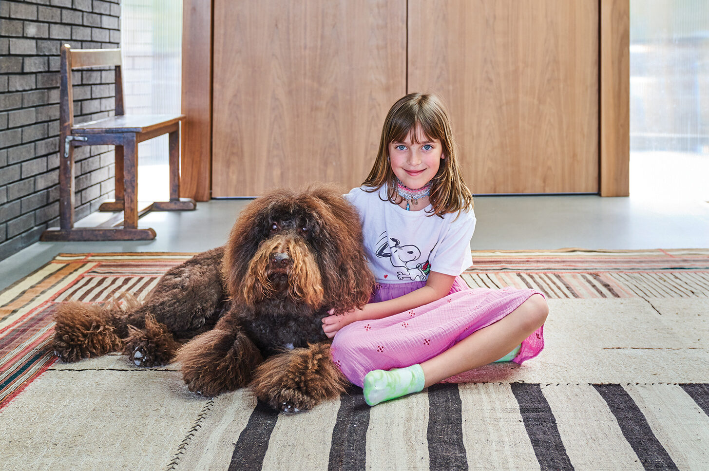
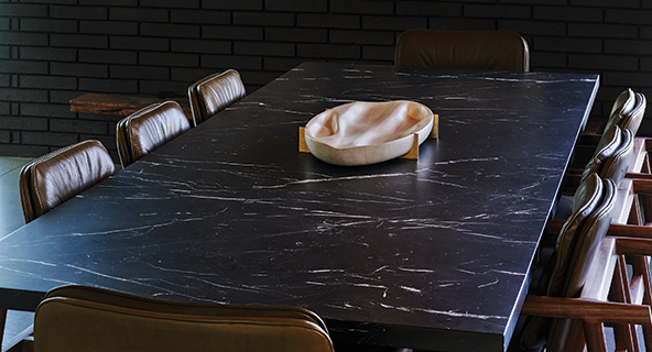
Above: Charlotte with goldendoodle, Woody (left). Working with Julie Feehan Design, Rebecca selected the marble dining room table from Croft; the chairs were custom made by Earl Furniture. The chandelier is from Italy.
•••
Both homeowner and architect call their three-year collaboration a rewarding experience with stellar results. The home, with its thoughtful landscaping and artful fusion of organic materials, catches your eye as you drive by. Once inside, your eye can’t resist darting around; the more you look, the more you see. From the modern features like the pop-up door to the coffee station in the kitchen to the vintage elements like the chandelier in the dining room, everything feels like it belongs.
The key, according to Arin, is restraint.
“Both designers and clients tend to overdo. I think the trick is to be light-handed when designing, so that these elements don’t become distracting. I once heard an architect say, ‘You need to grab a building and shake it until the excess falls off.’ Thoughtfulness should be applied when selecting architectural finishes and features, furniture and accessories. Choices should have meaning and purpose. If it doesn’t make the cut, let it go.”

MIXING OLD & NEW
ARIN SHARES SOME ARTFUL WAYS OF INCORPORATING A MID-CENTURY MODERN VIBE INTO A NEW BUILD.
- Design long, single-story, flat rooflines with overlapping planes, paired with the clerestory windows.
- Use a variety of materials—wood, brick, concrete, stone—with intentional placement.
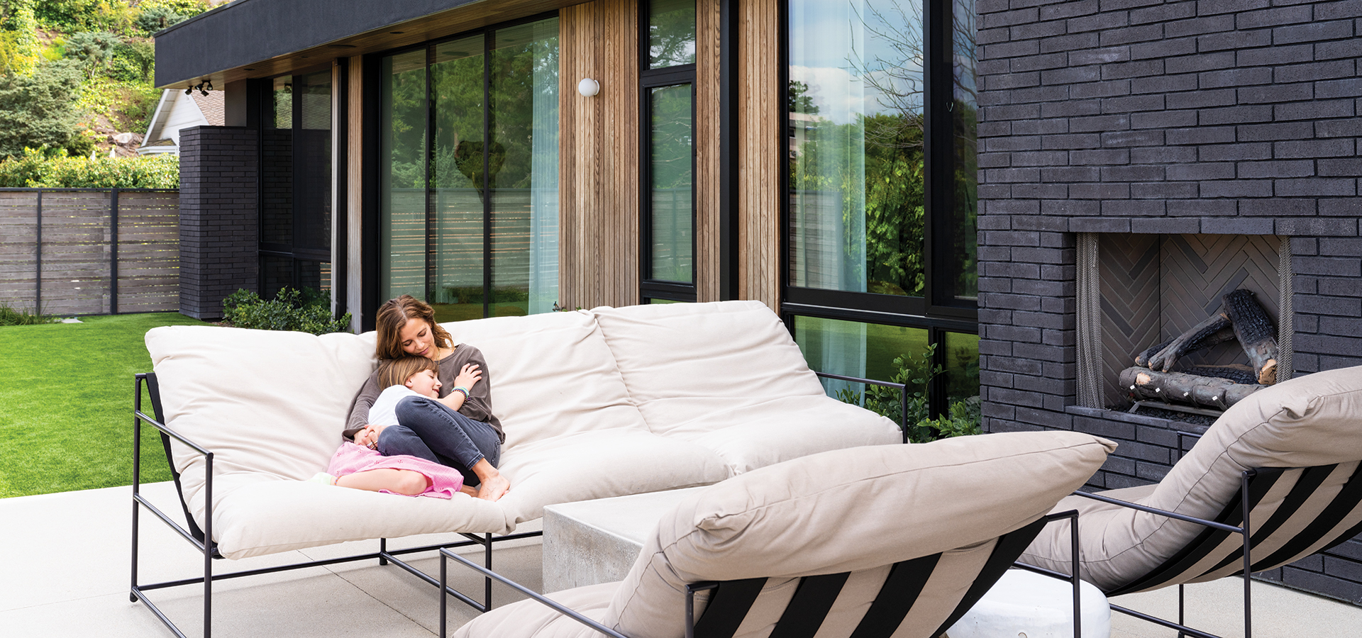
- Foster an indoor/outdoor vibe with large expanses of glass to visually and physically connect the two. Also bring exterior materials inside, further blurring the boundaries.
- Create visual moments, such as framing a thoughtfully landscaped area with strategically placed glass windows and doors that allow peeks at outdoor plantings, or bringing the landscape inside the house as we did with the entry planter that was fitted out by Plants & Spaces.
- Integrate a well-landscaped and accessorized courtyard.

Join the Valley Community