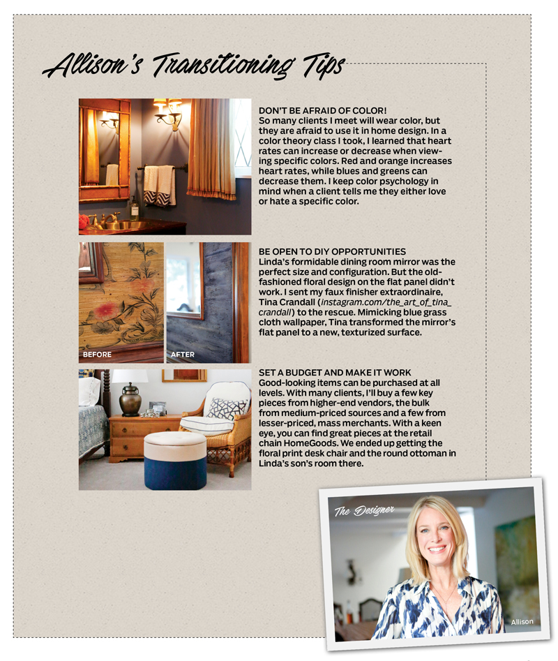


Tricks of Transitioning
With the help of a creative, clever designer, the teenager-ravaged traditional home interiors of Ventura Blvd’s editor get an updated look.
Live in a house long enough, and it will probably happen to you. You put your heart and wallet into your home, and for a while the decor looks terrific. Then suddenly chips and nicks catch the eye. That lime-green nubby sofa fabric, which originally felt so fresh, starts to look dated. You notice how much light the Dupioni curtains are blocking, and the earthy wall tones start to feel “icky” instead of warm. Dominoes keep falling …
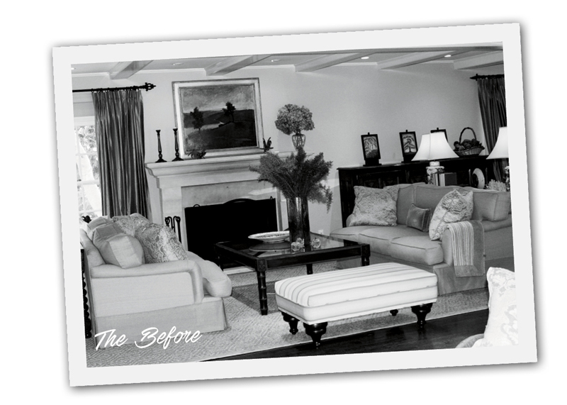 That—plus the hard living of teenage residents—is what motivated me to recently re-do part of our home. I had also simply tired of my traditional interiors. After 11 years, I just wanted something different. I’d begun to look at ways I might switch it up, but I was stuck. I just didn’t know how to do it without starting from scratch, and with our substantial investment in antiques as well as a second child about to go to college, that simply was not an option.
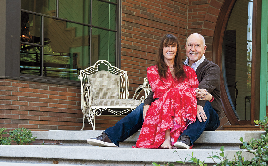
Then last summer I was invited to dinner at the home of Craig and Allison Knizek. He’s a local Realtor; she is an interior designer. With their company, Prescott Properties, they buy, re-do and sell homes. I was captivated by the guesthouse they’d just built on their Sherman Oaks property. The bright structure had a fresh, modern vibe with clean lines and fun, geometric patterns.
“It’s transitional,” Allison quipped while showing me around. “It’s a blend of traditional and contemporary.” The lightbulb turned on.
My collaboration with Allison began with a “no-b.s.” discussion at my kitchen table. Allison and I struck a deal that was within my financials and adhered to my inherent practical sensibilities. (She works on an hourly fee basis and does not mark up items for clients.) Then we did a walk-through.
“Linda already had perfect ‘base pieces’ and wonderful, meaningful objects and art in her home. So I first assessed what items we would reuse, what we would rework and what would need to be purchased,” recalls Allison.
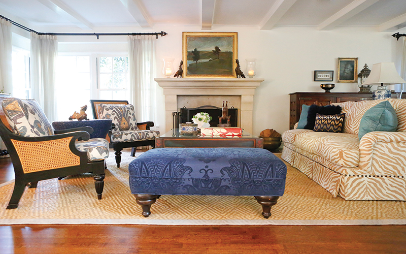
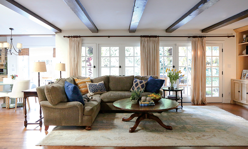
Next: color palette. I wanted more blue in the home and white walls on the open, main living area—the entry, living and dining rooms, and kitchen. We nuked the notion of repainting a finish on the honey-hued kitchen cabinets and matching built-in cabinetry in the family room. Our goal was to select a white that would work with that shade.
We viewed paint samples on walls during day and night and picked favorites. My husband and I kept gravitating toward “white whites,” but Allison cautioned us it would feel too antiseptic given all the existing warm tones. She held firm on warm whites, and indeed she was right. The color selected, Frosting Cream by Dunn-Edwards, turned out to be perfect.
I bought a John Robshaw pillow with blues and greys for the guest bedroom, and it became our inspiration for everything from paint to Roman shades. White with a hint of grey was selected for one son’s bedroom; we chose a deep navy blue for the powder room.
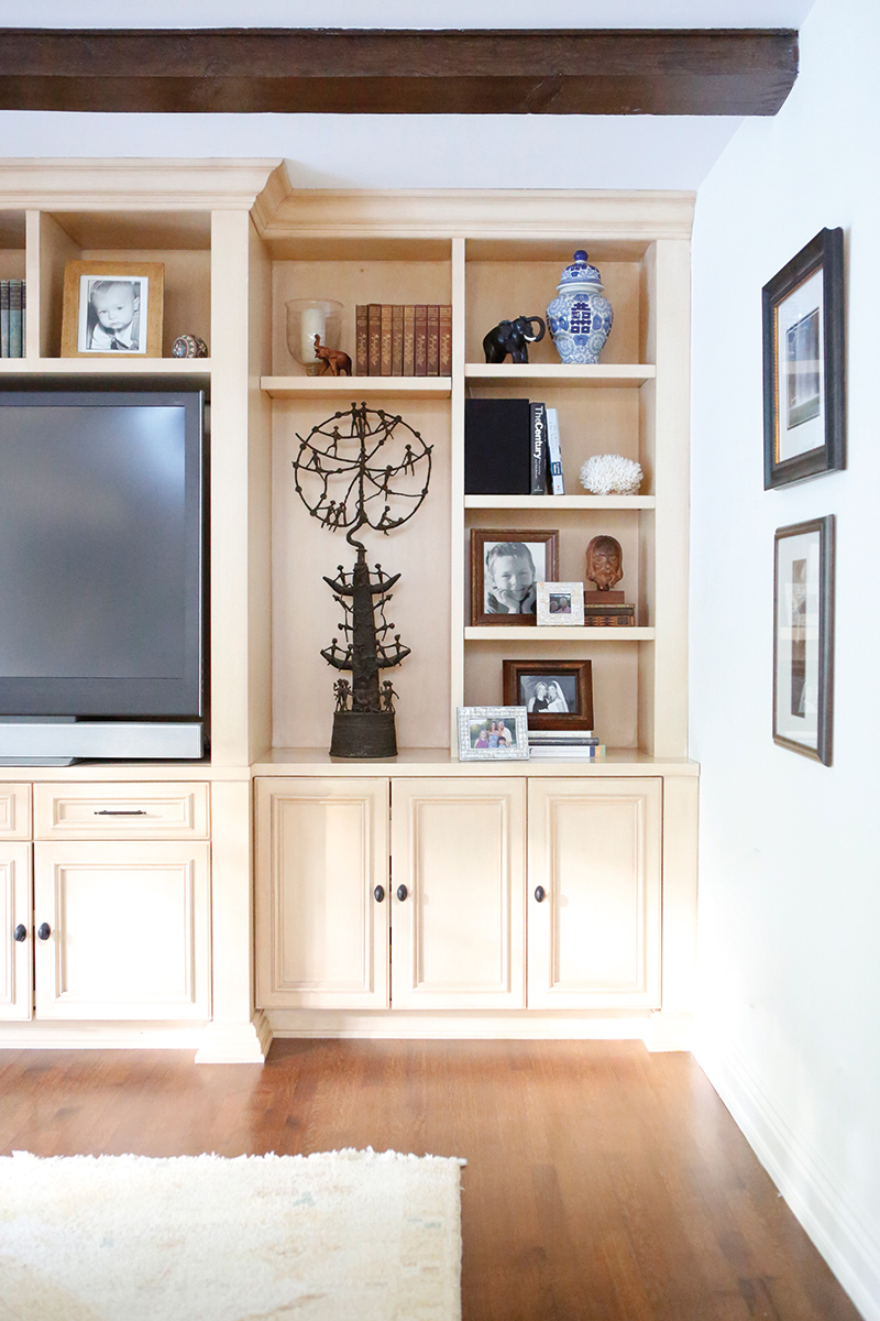
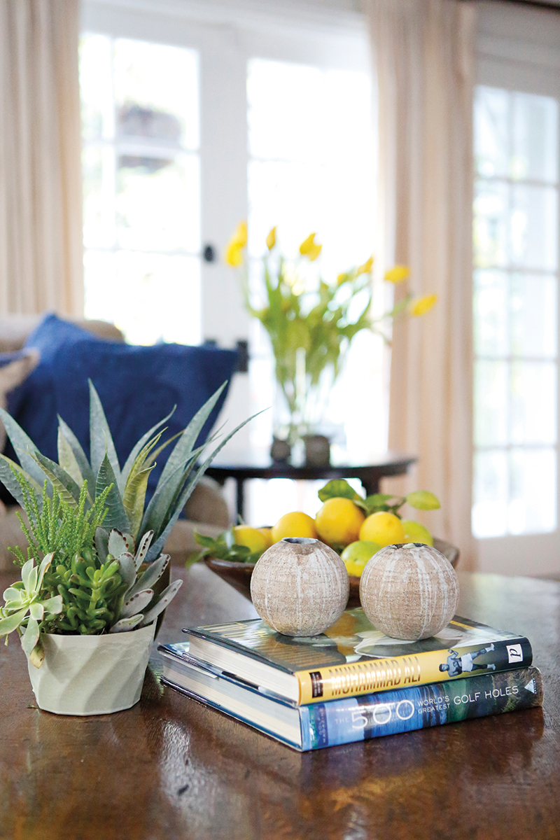
SMALL SPACES: Adhering to color palettes for each room, Allison created vignettes on tables and shelves. Blue was integrated into the family room shelves with ginger jars from Williams-Sonoma. Antique books were kept in the same color family.
One of the things I didn’t like about the living room was that the dual sofas made it feel too blocky. Allison suggested swapping one of the sofas for two chairs we already owned. They had been purchased together but were currently in different rooms.
“Looking directly at the back of a sofa when you enter a main living area creates a mental block. It feels as if you need to walk around it rather than being invited to it. Chairs draw you into the room in a more inviting fashion—especially ones like these with open, rattan backs,” the designer explains.
“I didn’t know there was chocolate in my back pocket!” and “It wasn’t my pen!” Those were the kind of comments I’d heard for years. Fatigued from blowing gaskets over stains on expensive fabric from the Pacific Design Center, for this round of decorating moderately priced fabric stores were pinpointed. I fell in love with an ikat pattern at Calico Corners from the Nate Berkus line. The large pattern was ideal for the chairs. Teal was integrated, as it went well with navy blue, and it also picked up that shade in a painting.
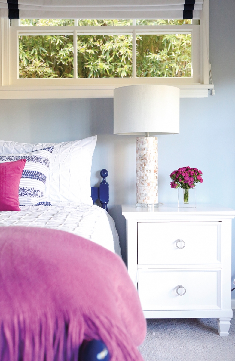
Be my guest: The blue-and-white John Robshaw pillow was the inspiration for the guest room. Shiny pulls on the side tables were swapped for brushed nickel ones from Liz’s Antique Hardware.
Under Allison’s guidance, we looked at a wide variety of patterns and colors and textures. One day my husband came home, took a look at all the samples splayed out all over the room and remarked, “How’s this all gonna work?” In a rare move, I didn’t say anything. Point of fact: I didn’t know.
Originally I wasn’t sure about the “cheetah” fabric on the sofa. Was it trying too hard? I don’t like spaces that feel too decorated. Allison, on the other hand, was sold.
“Even though it is kind of a ‘wow’ fabric, it actually reads as a ‘neutral’ and balances out the other bold colors and patterns on the chairs and ottoman,” she says. This is where trust comes in; you’ve just got to be able to defer to your designer on certain things. We went for it. Allison upped the hip factor by putting oil-rubbed, bronze bullets along the base and on the arms of the sofa.
Any fabric I fell in love with that was over budget, Allison found online or had our upholsterer (WM Upholstery in Sherman Oaks) get a better price. These days you can get many high-end designer lines (or something strikingly similar) via the internet if you have the right information and are willing to put in the time.
The sectional sofa in the family room presented a challenge. The cushions needed some foam wrapping, but the fabric was in decent condition. However, the mossy grey tone was off. An assortment of blue sofa pillows tying it into the living room solved the problem. The pillows were purchased online from The Company Store, West Elm and Crate & Barrel. One day we chose the “finalists” from a batch of more than a dozen. It was the finishing touch on a job that was well-executed and well-received, even by my husband.